We developed a graphical UI and user experience concept for Logitech’s smart control suite, which can be easily hooked up with their smarthome station (Link).
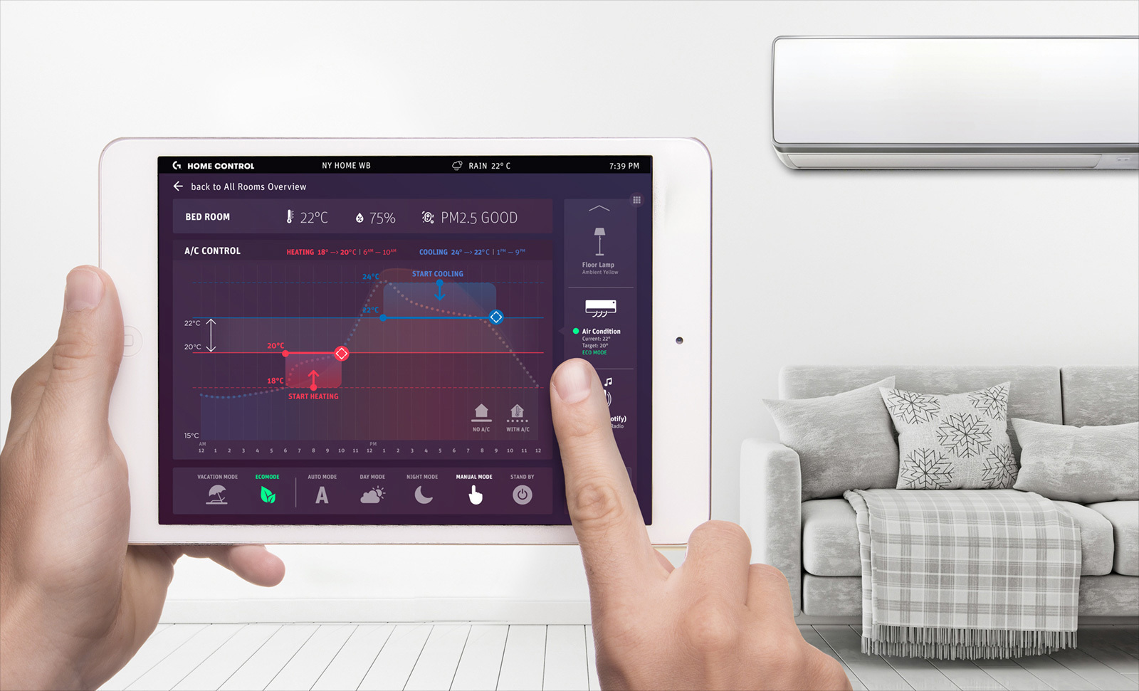
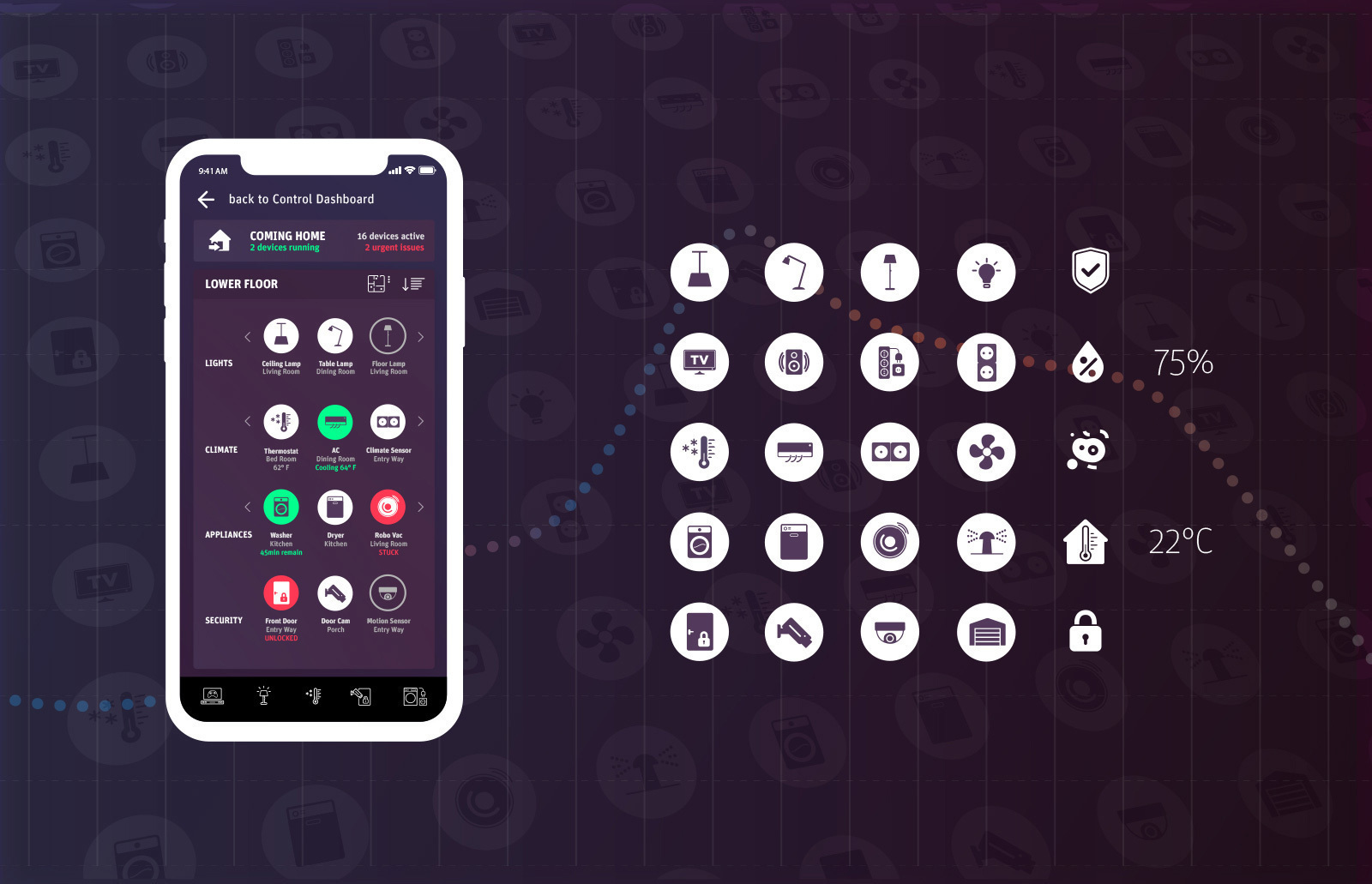
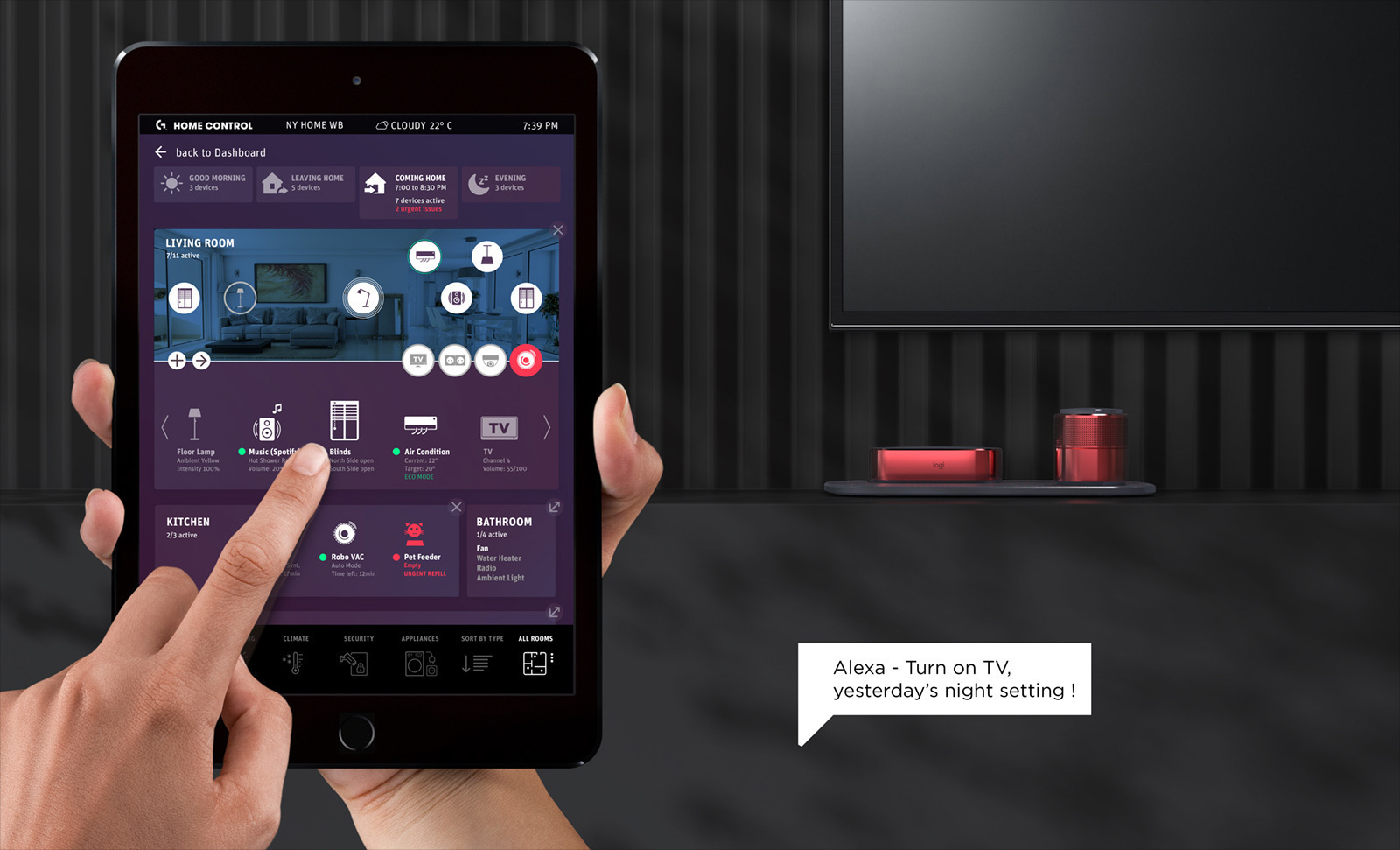
With the challenge to control and manage an increasing number of interlinked smart home devices – potentially many dozens – we explored more practical ways how one could intuitively (also simultaneously) identify as well as control a plethora of devices on the small screen estate of their smartphone or tablet. Initially, our UX research revealed that many of the available smart-home control apps were strongly focused on parametric or technical information, not meaningfully processing the output for intuitive human understanding. Also, graphical arrangements or lists of different devices, programs and settings seem too often prioritised in irrelevant ways, which seemed confusing from a user perspective.
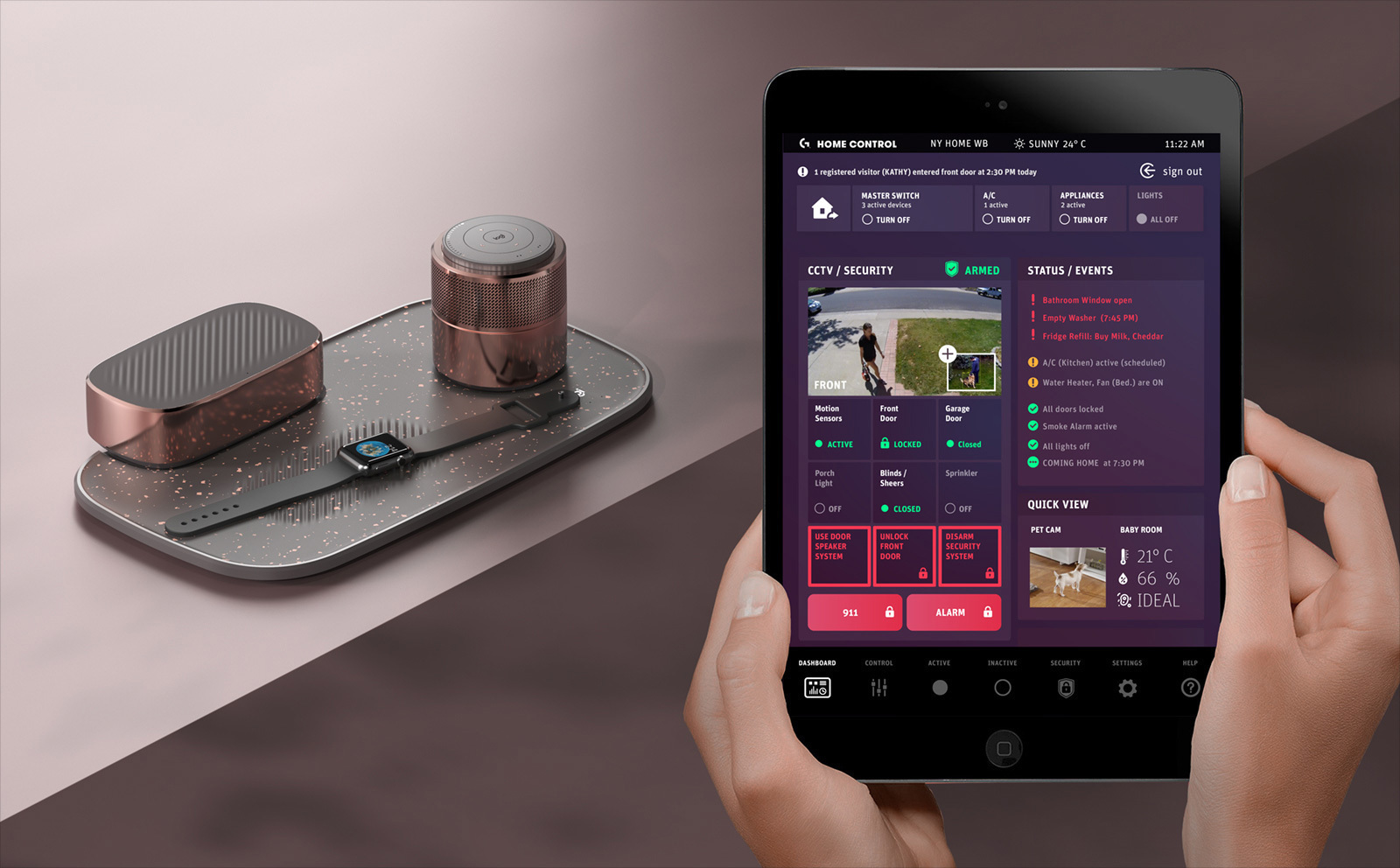
Photo-realistic images of each smart-home device (appliances, consumer electronics, sensors, home security) seemed to be a viable solution in providing familiar visual clues to the user, yet this would have cluttered the UI beyond clarity, in particular when flipping through a large number of smart home devices. Eventually, the most intuitive sense-making solution that materialised was also the most perceptible: Provided with the ability to take panorama photos of their rooms, users can place customisable icons of each connected smart home device into these interior shots, each distinctively named in order to ensure optimal familiarity.