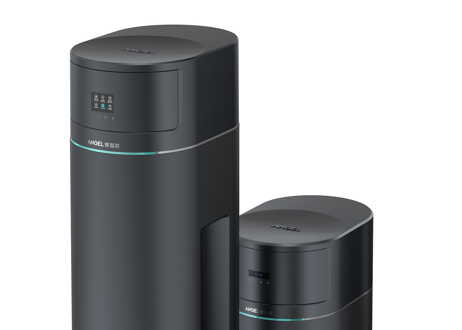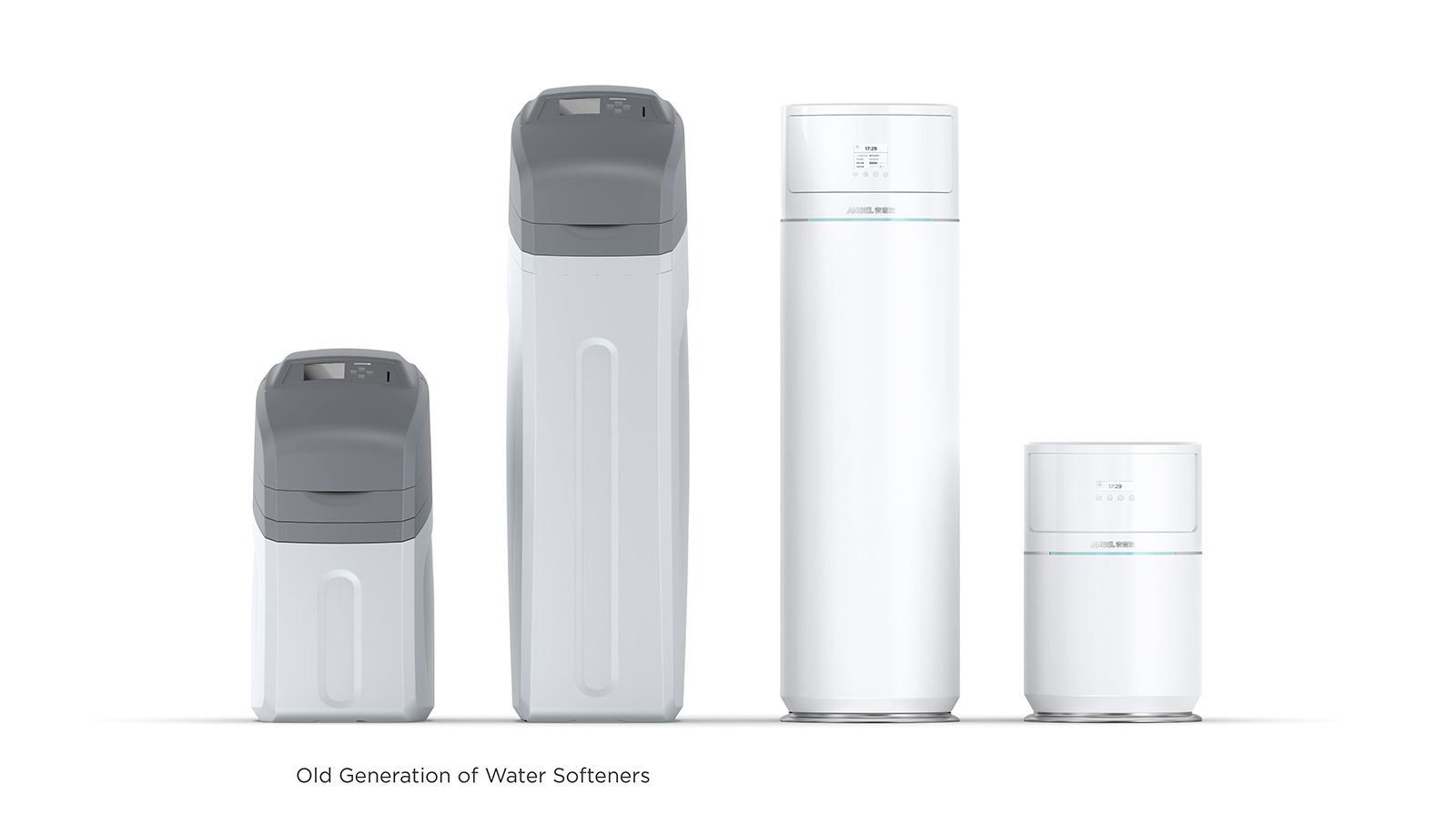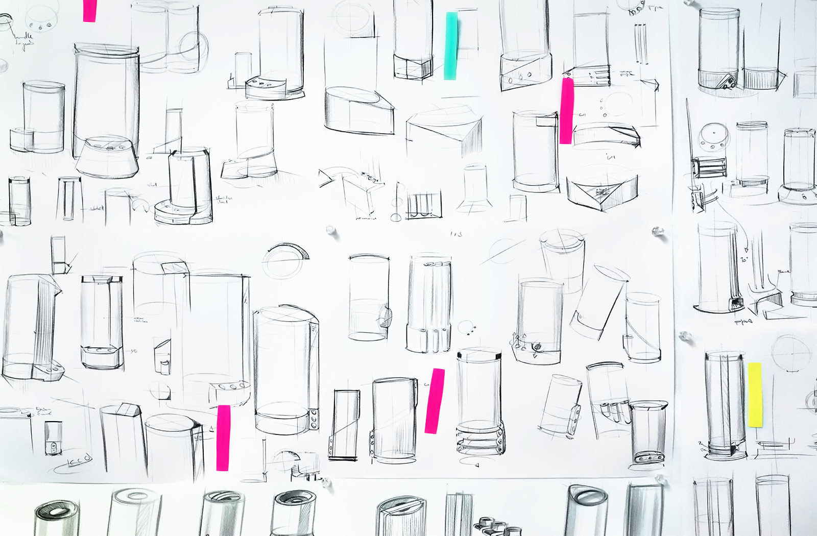
Envary was commissioned to design Angel’s new family of Water Softeners. Only having previously used generic hardware platforms, which were also assembled by other competitors, the company’s management was poised to leverage Angel’s rebrand with a new product line developed from scratch. Thus the design objectives were closely aligned to Angel’s plans building a unique product family that would iconically differentiate to the rest of the market, and also ‘shake off’ the dated look of the old products’ box-like appearance.
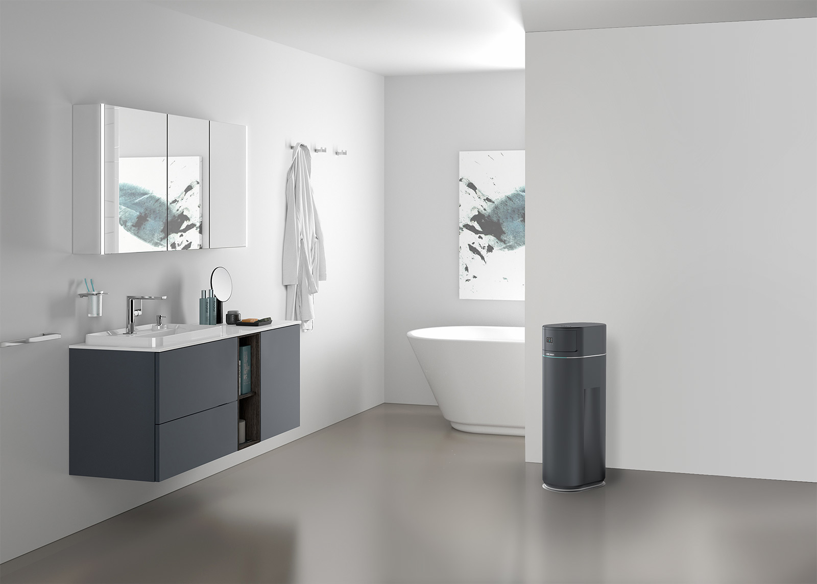
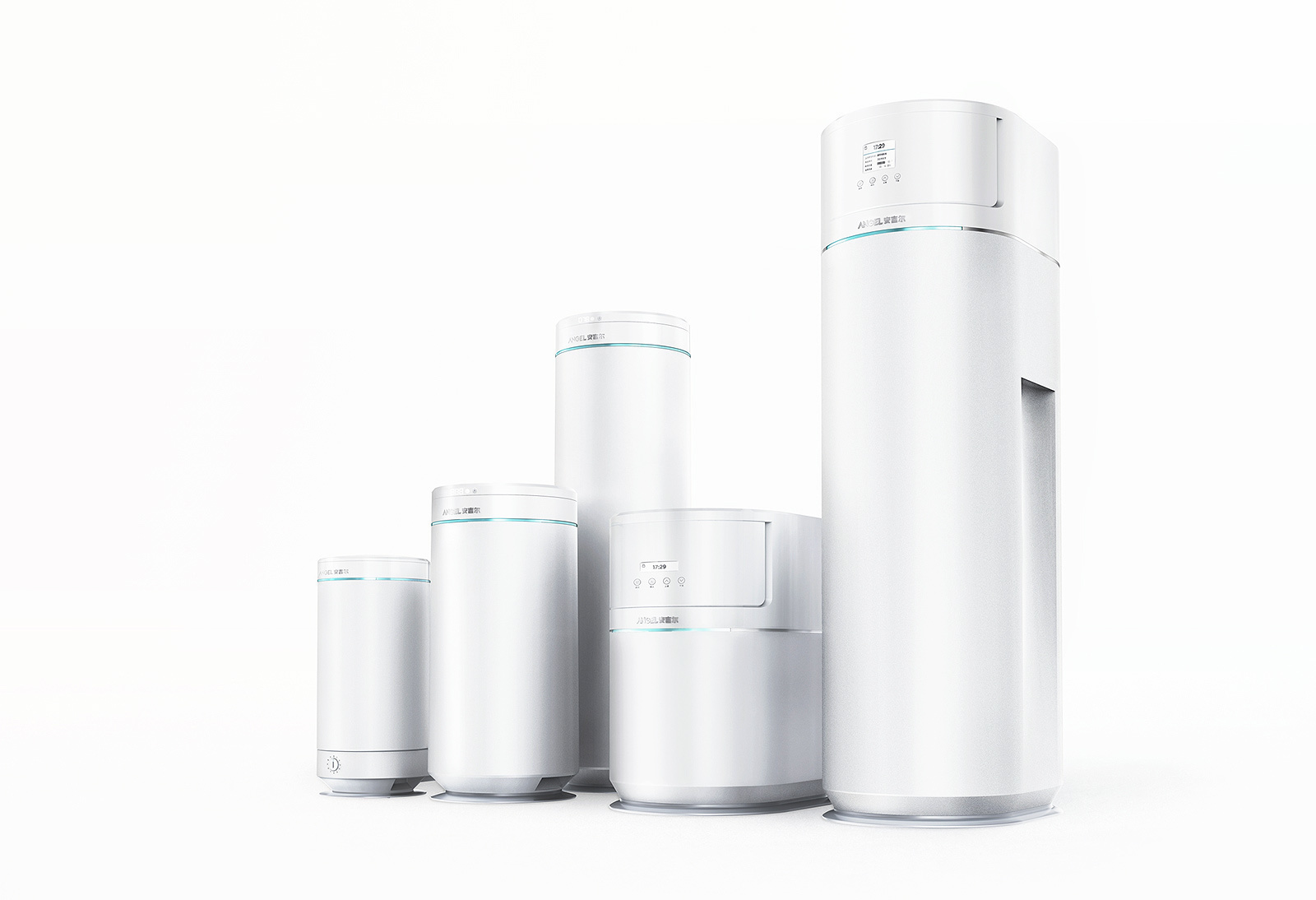
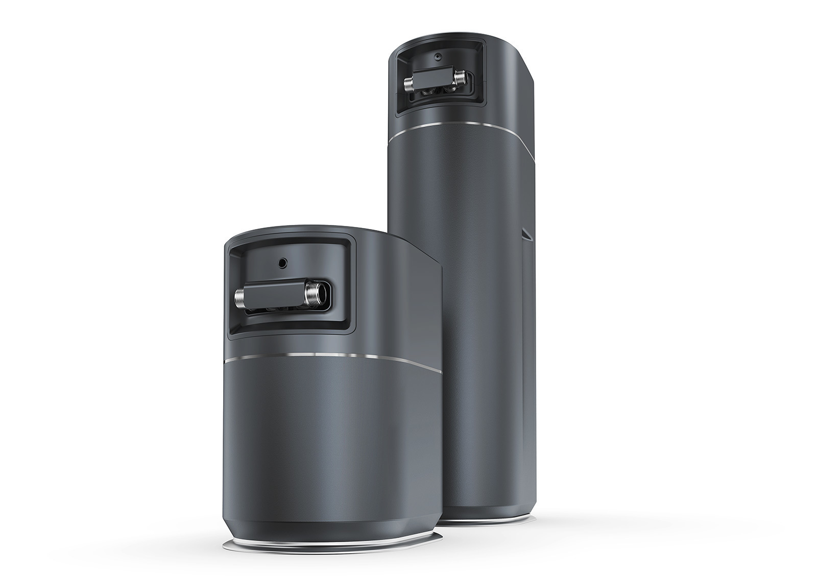
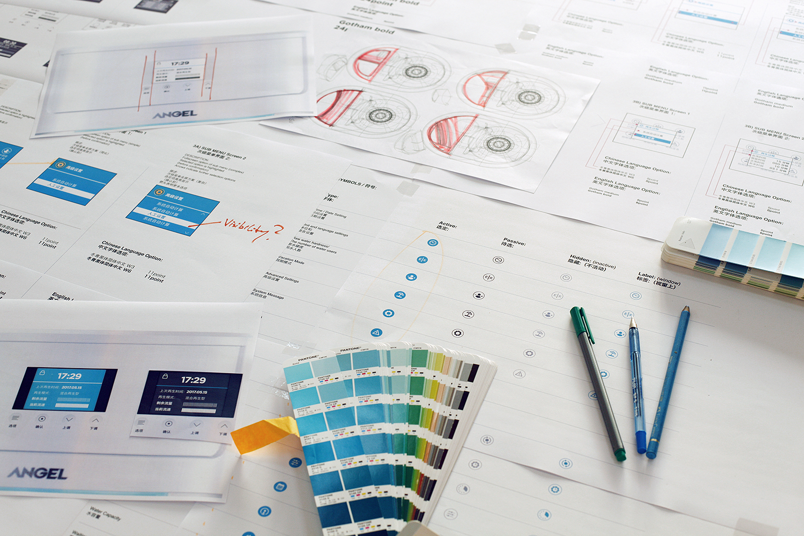
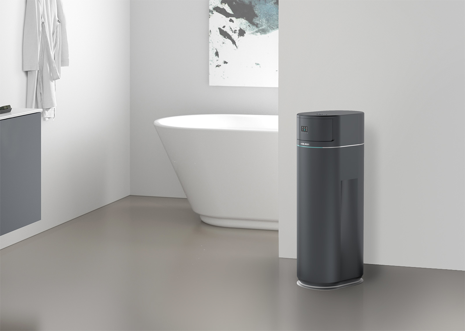
Innovating the 2 water softeners for the Greater China market meant success-critical UX insights had to be identified that would enable user-centric assessment of spatial factors (smaller form factor), product setup (shortening customer servicing times) and user interaction (better legibility of status display). In order to allow for more flexible product placement the UX exploration had to be tackled in consideration of spatial needs in typical use environments (the softeners are placed in basements, on balconies, in kitchens, restrooms, tiny utility rooms, barns or small storage cabinets), of which some environments would significantly challenge users to correctly maintain their softeners.
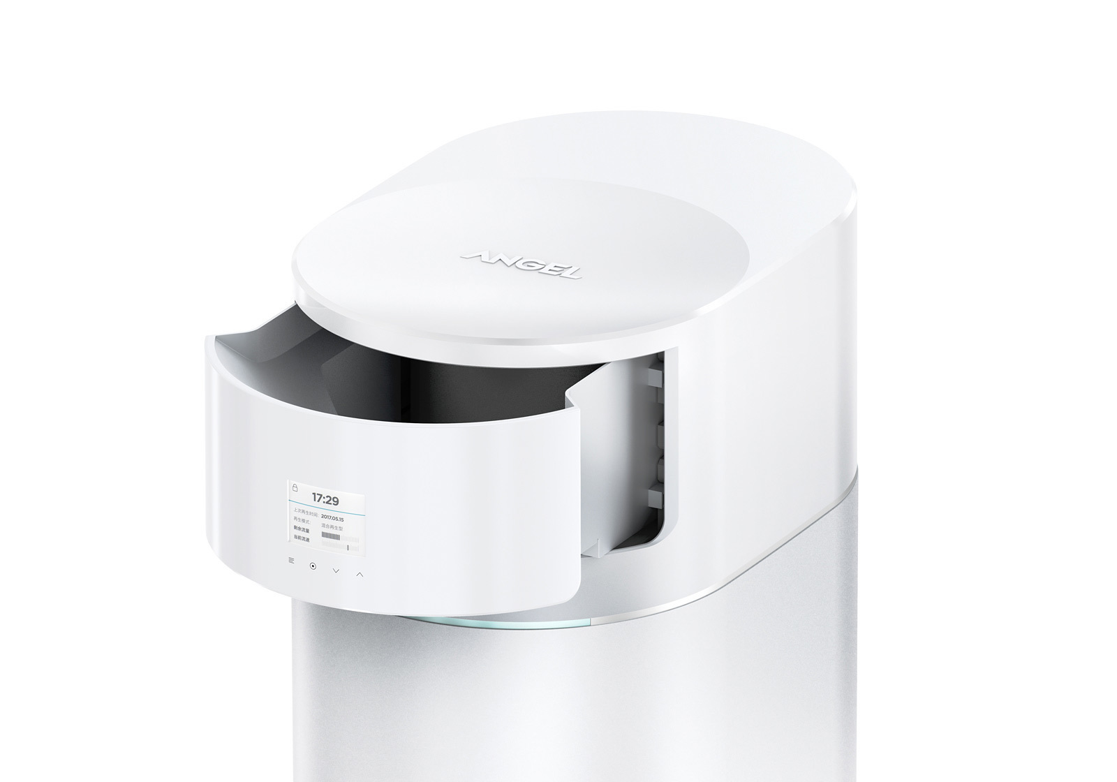
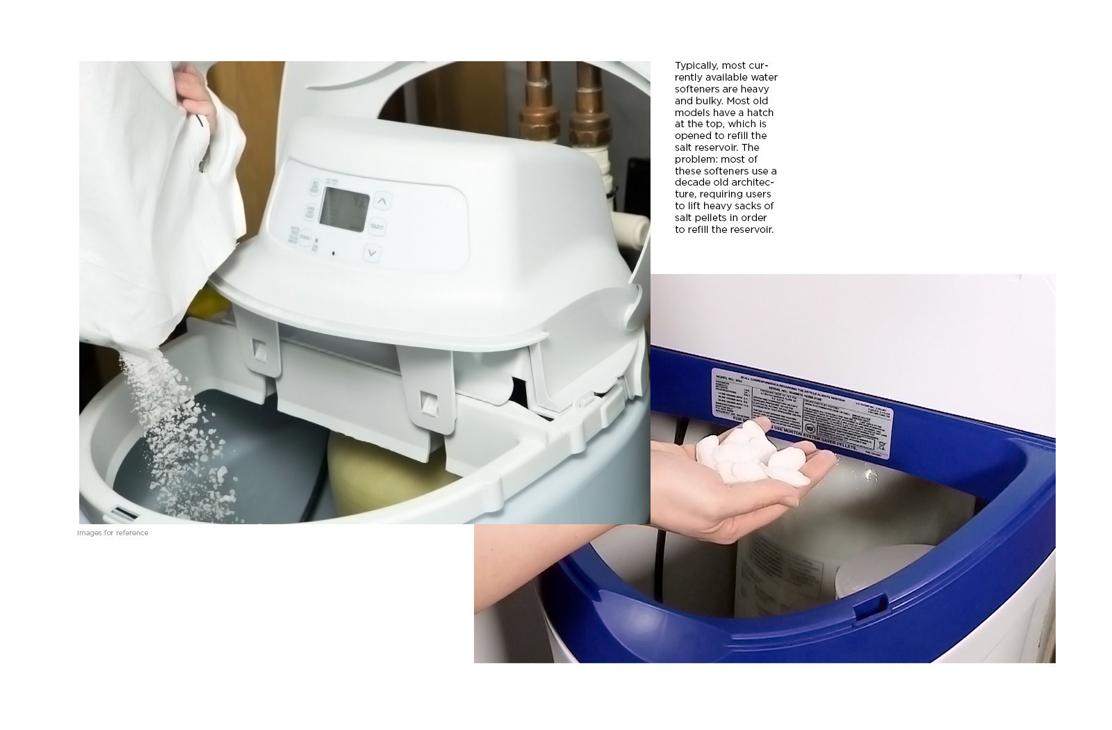
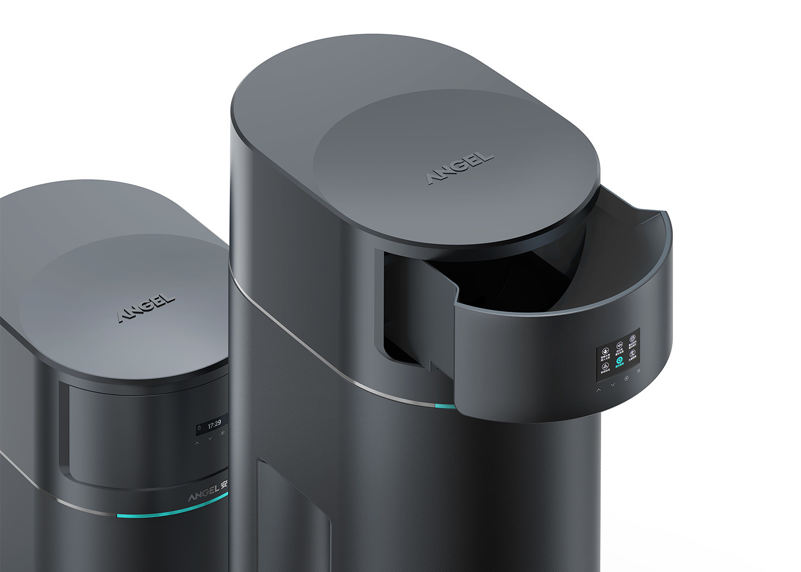
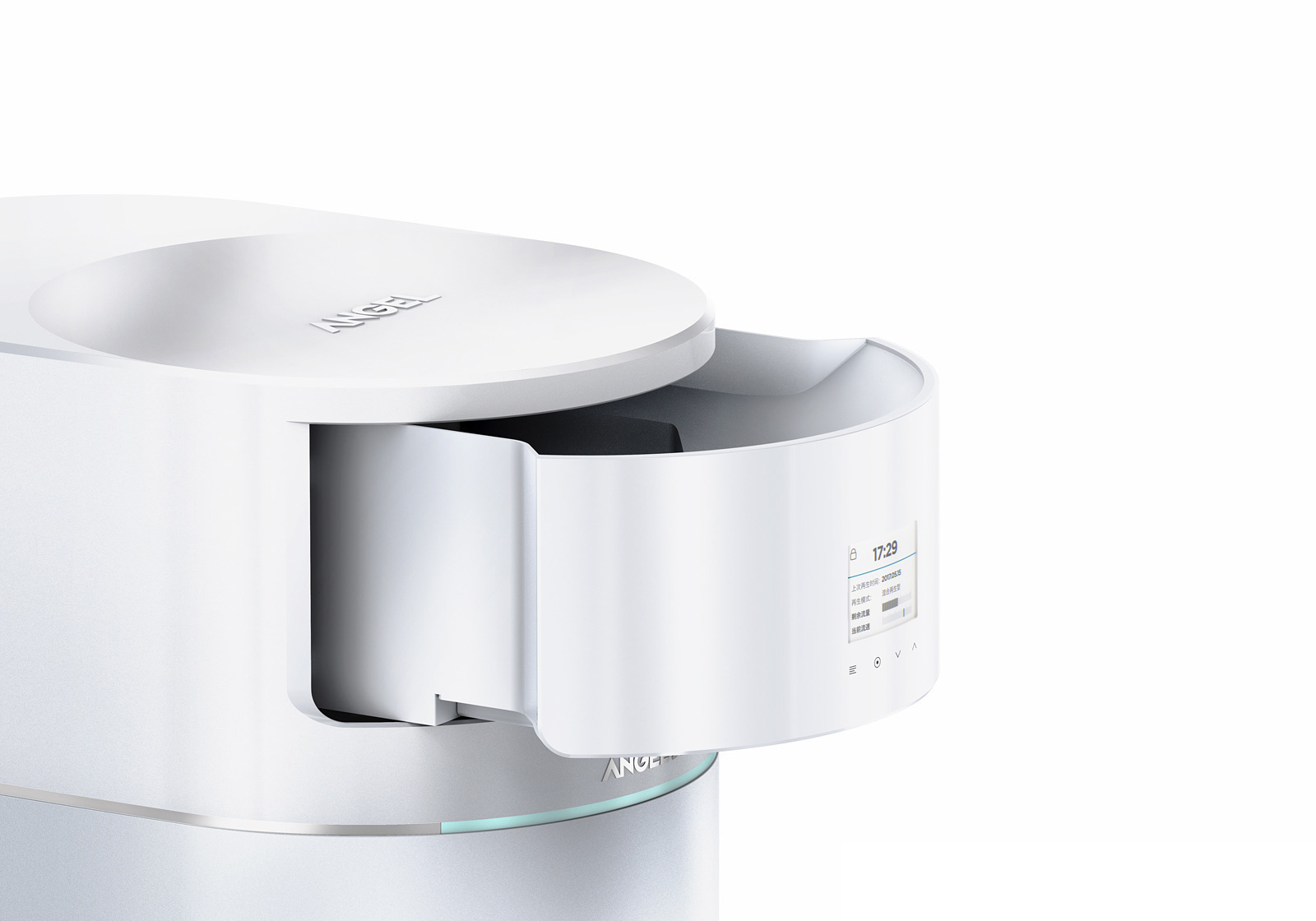
Requiring periodical refills of salt pellets, most customers expressed uncomplicated maintenance and easier refills as their key value criteria, in particular in respect to the small softeners that would be often placed in grid-locked cabinets under the sink. With the goal of discovering pain-points and opportunities it was success-critical to tap into new ideas empowering users to refill their softeners without having to detach the top enclosure part (like currently available softeners) or even having to manually move the heavy volume.