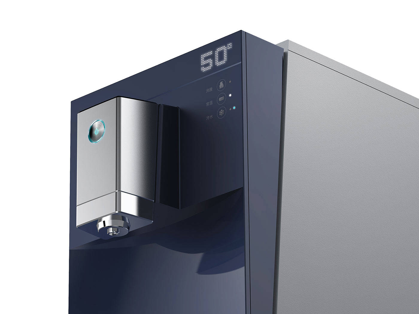
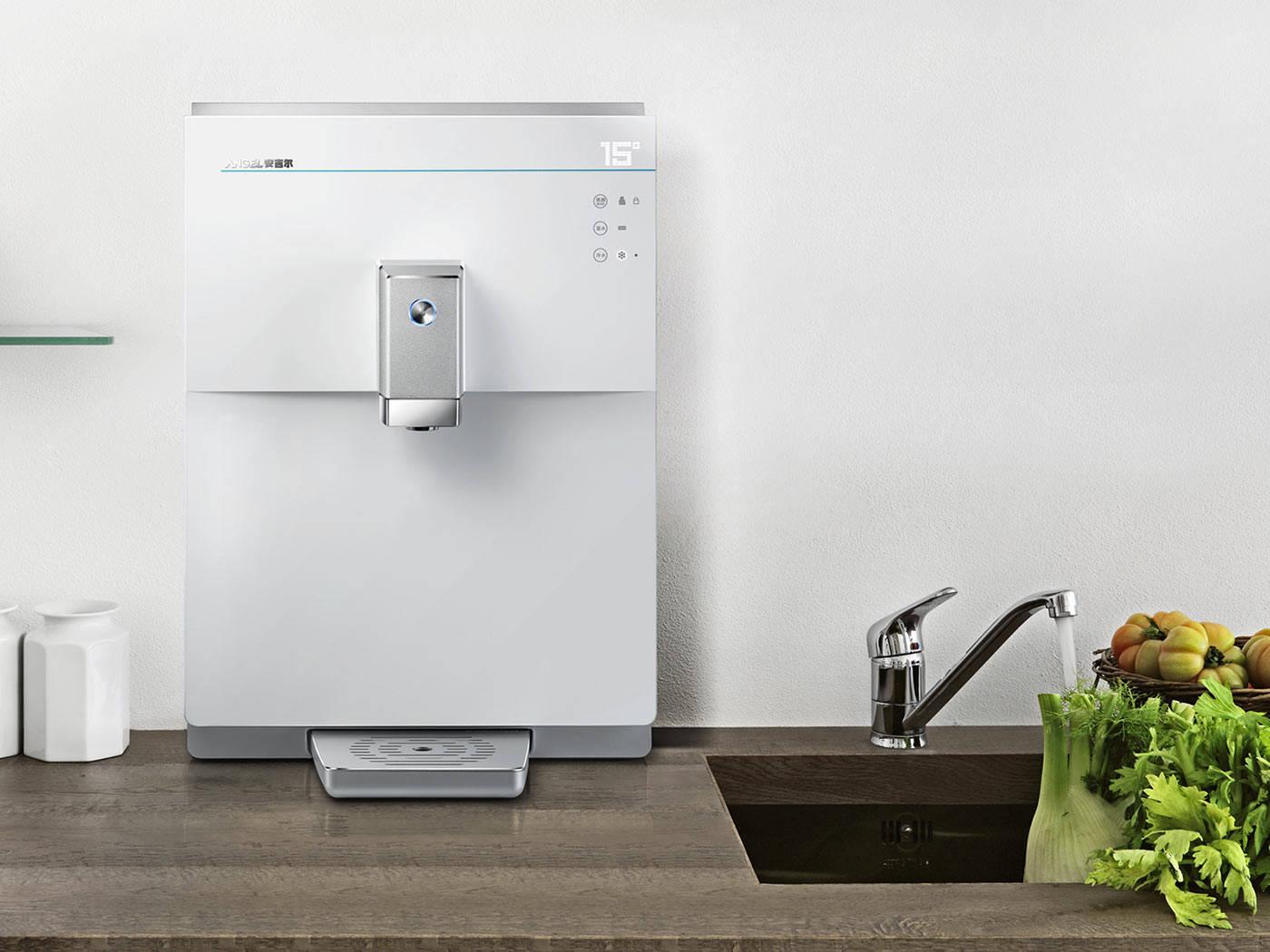
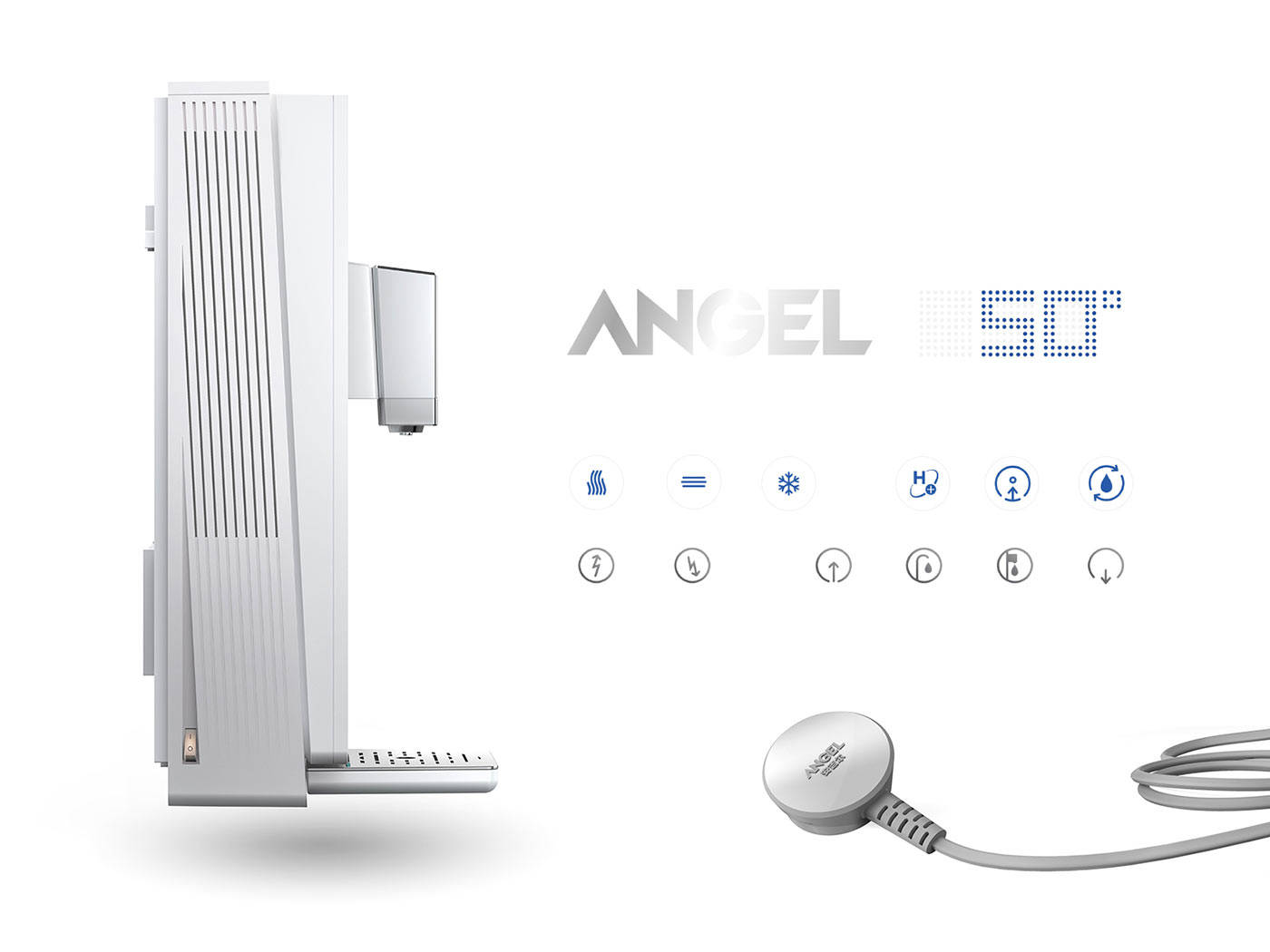
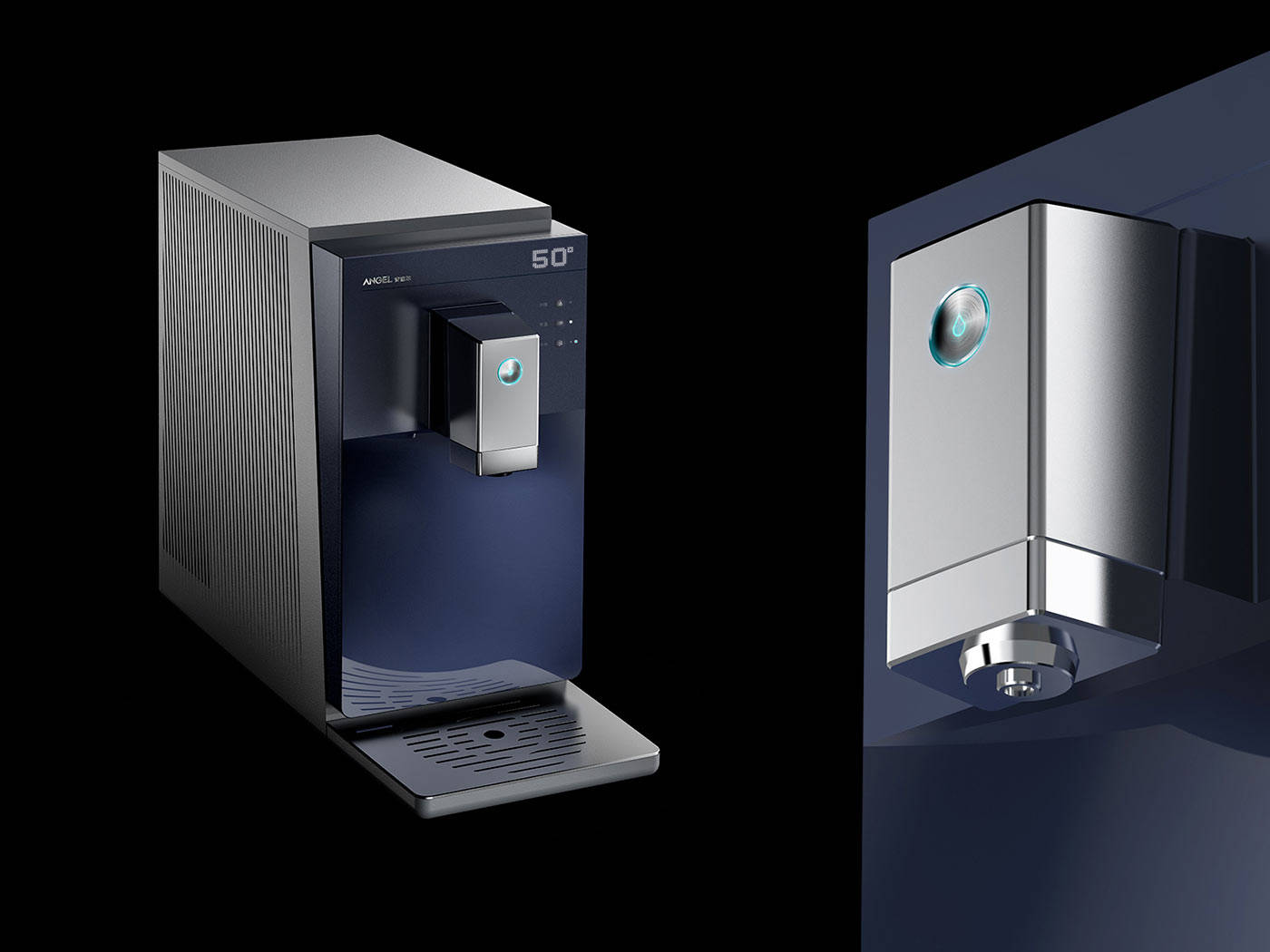
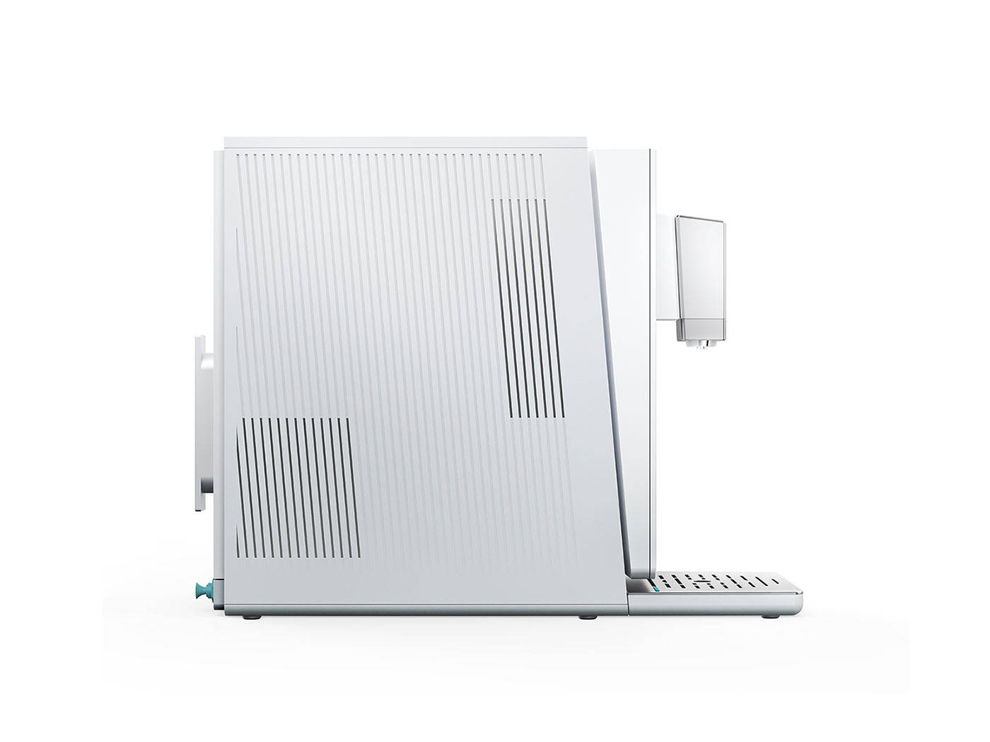
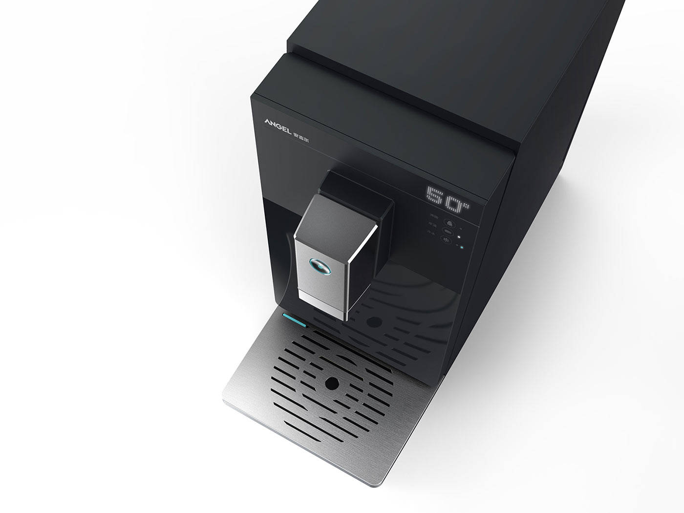
China’s water appliance brand Angel Shenzhen and WPP’s branding network Landor partnered with us to develop a holistic product identity for Angel’s growing B2C product portfolio consisting of water dispensers, filters/purifiers and softeners. To strengthen the brand’s position against increasingly powerful competitors such as Haier, QinYuan and Midea we teamed up with Landor having initially created Angel’s scientific-inspired brand strategy. Aiming to enhance brand recognition as well as value perception amongst China’s growingly e-commerce driven shoppers, consumers should instantly recognise any Angel product. The iconic design language would also help Angel to better convey its advanced filtering technology.
Angel: Product Identity
The new brand guidelines at hand, we adapted the scientific look into a powerful product design language to shape Angel's future products
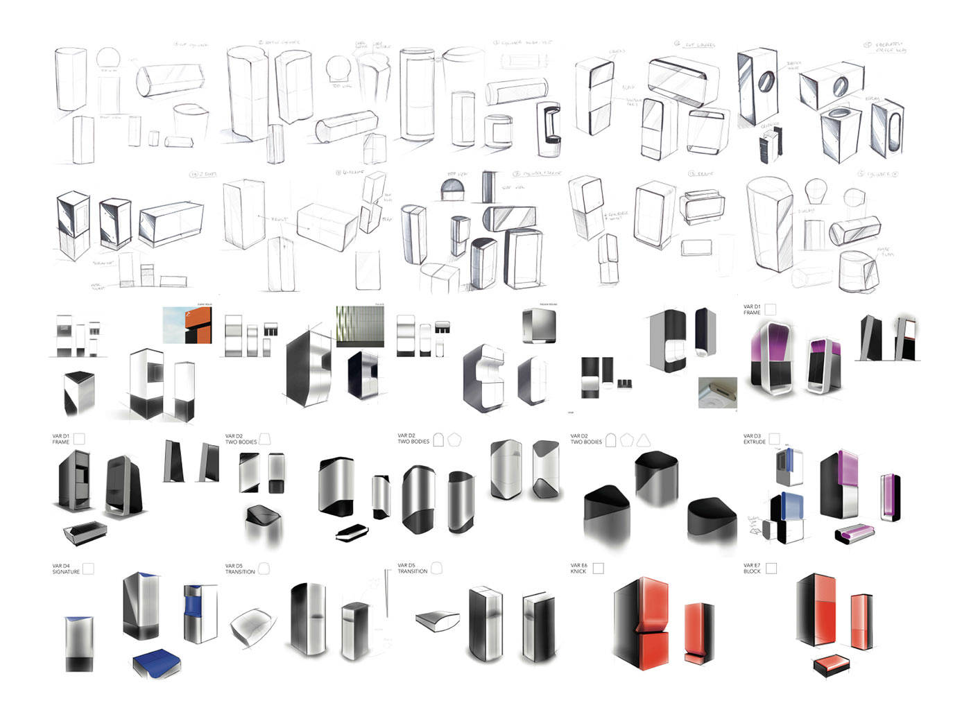
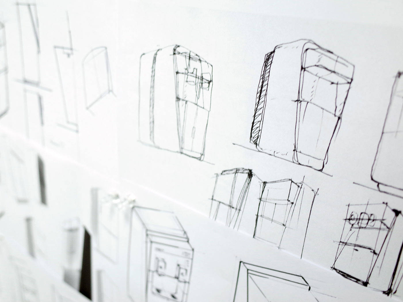
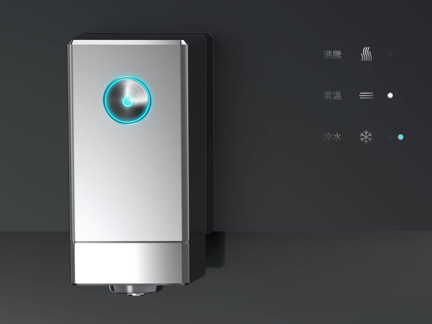
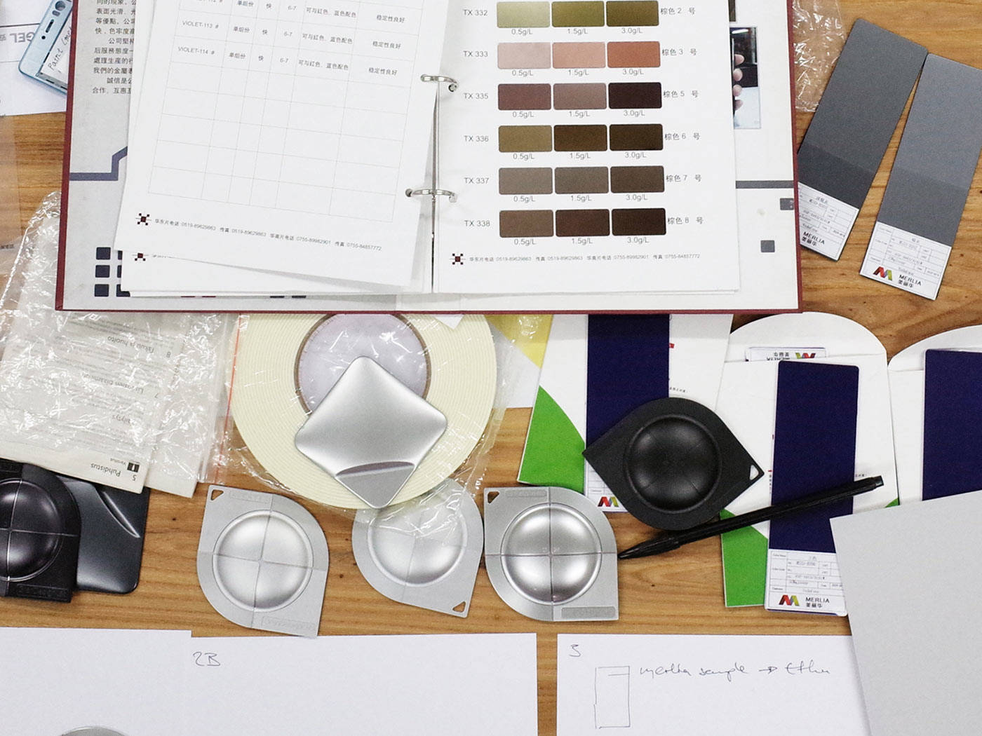
What we did: In this context Envary had to develop a coherent design language consisting of shape architecture, form details, user interface, CMF, branding, yet also consistently evolving functional elements (PUI, movable parts, functional design). With the obstacle of different form factors and structural designs of Angel’s products, we iteratively developed design rules universally adaptable to different archetypes of products. Collaborating closely with different client teams, we evolved all guideline-centric details piece by piece then developing selected product designs in parallel. Eventually, we designed Angel’s complete B2C product line based on the design guidelines involving 12+ products, which are launched throughout 2016, 2017, 2018.
